Flex Grid System
Check out the powerful features of custom flex grid system included in our toolkit for bootstrap.
It is really flexible, well documentated and easy to use.
Take a look to some tasty features of our flex grid described below.
Default Layout
See an responsive example of default 1170px layout in action


Condensed Fullwidth Layout
Take a look to responsive image grids created with our condensed fullwidth layout


Wide Layout
Test our additional wide 1770px grid layout
Responsive & Retina
The information should be not only well - organized and easy to read, but it should be also presented in a visually pleasing manner, thus making the process of reading an enjoyable journey.
Optimized for speed
The information should be not only well - organized and easy to read, but it should be also presented in a visually pleasing manner, thus making the process of reading an enjoyable journey.
Truly Multi-Purpose
The information should be not only well - organized and easy to read, but it should be also presented in a visually pleasing manner, thus making the process of reading an enjoyable journey.
Seo optimized
The information should be not only well - organized and easy to read, but it should be also presented in a visually pleasing manner, thus making the process of reading an enjoyable journey.
Mixed Layout
Mix a lot of predefined helper classes to create exact layout that you need
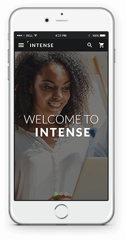
Intense is exactly what you need
The information should be not only well - organized and easy to read, but it should be also presented in a visually pleasing manner, thus making the process of reading an enjoyable journey.
Responsive Order Layout
Change display order of your content depending on screen resolution. Resize the page to see the action.
Social Integration
The information should be not only well-organized and easy to read. thus making the process enjoyable.
All images Included
The information should be not only well-organized and easy to read. thus making the process enjoyable.
2000+
icons
The information should be not only well-organized and easy to read. thus making the process enjoyable.
Responsive & Retina
The information should be not only well-organized and easy to read. thus making the process enjoyable.
Extensive docs
The information should be not only well-organized and easy to read. thus making the process enjoyable.
Video backgrounds
The information should be not only well-organized and easy to read. thus making the process enjoyable.
Bootstrap Grid
Default Bootstrap Grid is also included. Its fully compatible with Flex Grid from our Bootstrap Toolkit.